Wings academy
the Mission
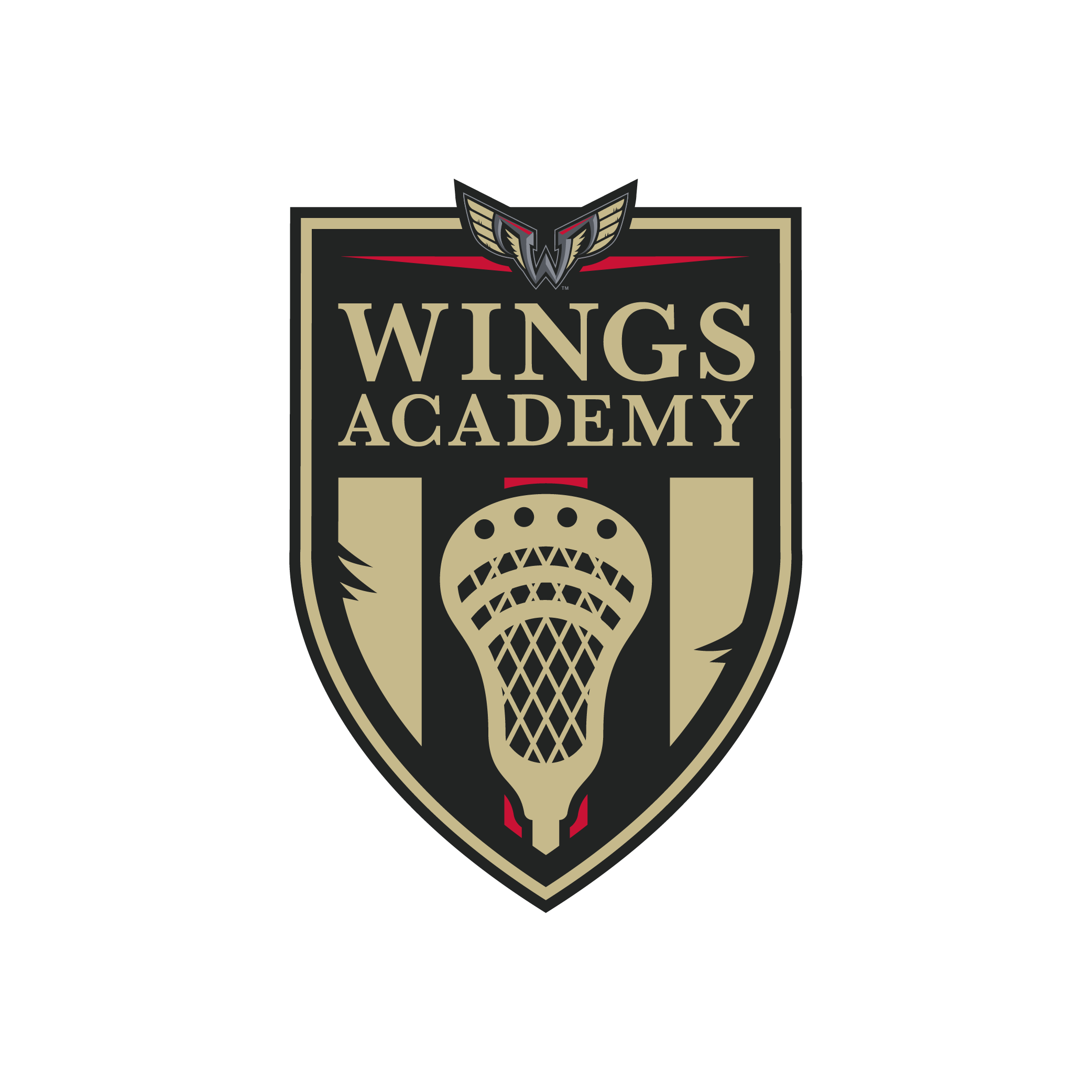
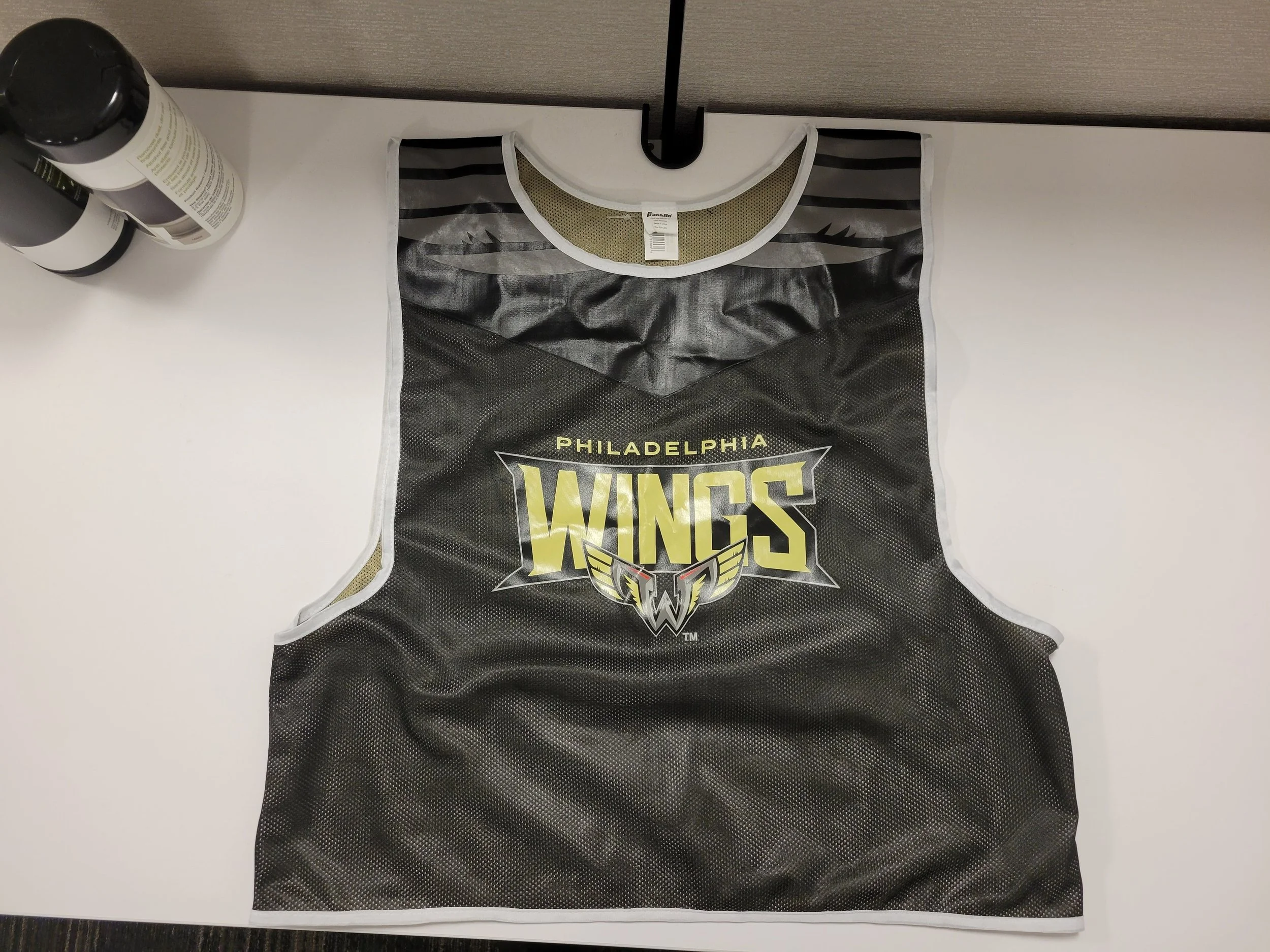
Develop a sub-brand for the Philadelphia Wings focused on growing the game of lacrosse through youth engagement. The assignment: create a logo that integrates seamlessly with the Wings’ existing identity, while designing custom Franklin Sports lacrosse sticks and pinnies for both print and digital execution. The visual system needed to evoke a sense of tradition, pride, and progression.
the execution
To align with the initiative’s educational focus, I designed a badge-style emblem inspired by the heritage of local private school crests — drawing from institutions like Episcopal Academy and Malvern Prep. The mark integrates iconic elements from the Philadelphia Wings’ primary logo, including the red triangle motif and stylized wing structure, reinforcing brand recognition while creating something distinctly new. A disciplined color palette rooted in the Wings’ established Pantone system ensures cohesion across all applications — from digital rollout to physical equipment. The final identity feels institutional yet energetic, designed to resonate with young athletes while honoring the city’s lacrosse legacy.
Tactical support
Logo Design + Print Design + Pantone Color Strategy
Tools of the trade
Ilustrator


