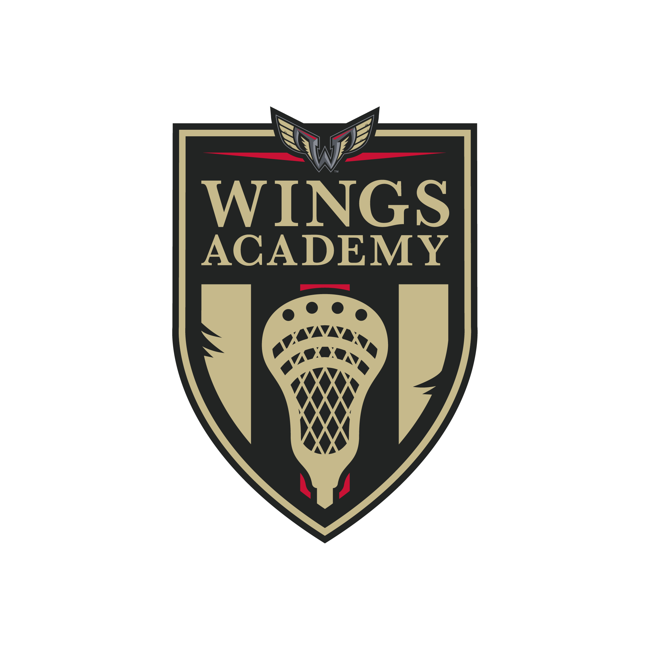
Wings academy
the Assignment
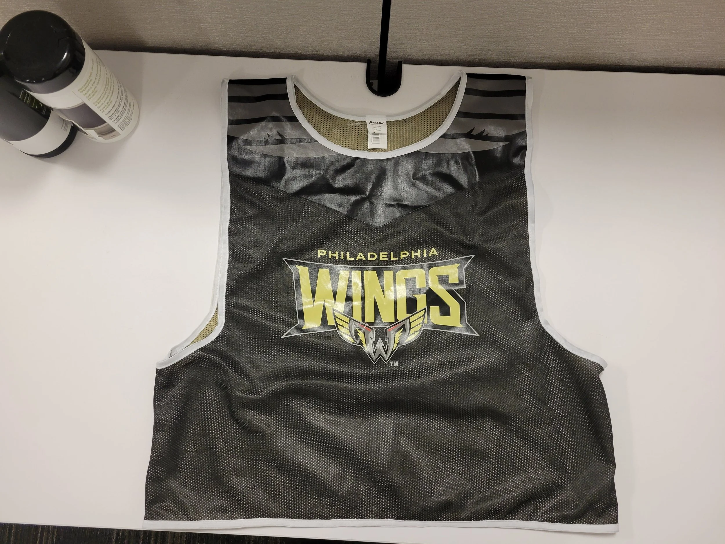
Create a logo for a branch of the organization dedicated to growing the sport of lacrosse. The logo will be used in both digital and print. It must incorporate the Philadelphia Wings logo, and additionally, a Franklin Sports lacrosse stick and pinnies need to be designed.
the solution
For the Philadelphia Wings' youth initiative to promote lacrosse, my goal was to develop an emblem embodying qualities of education, tradition, and a modern edge. Inspired by the distinguished emblems of local Pennsylvania private schools, such as Episcopal Academy and Malvern Prep, I crafted a design that conveys a sense of prestige and heritage. Elements from the Wings' iconic "W" logo, including bold red triangles and intricately designed wings, are incorporated to unify the design. A carefully chosen color palette, drawn from the Wings' established branding, ensures consistency and visual cohesion. The resulting logo not only captures the essence of lacrosse but also pays tribute to the esteemed institutions that inspire this educational initiative.
Services
Logo Design
Pantone Color Corrections
Print Design
Client
Philadelphia Wings Lacrosse Team


