Cali Cleanerz
the Mission
Design a complete brand identity for Cali Cleanerz — a San Diego-based window cleaning company with big personality and bigger ambitions. The goal: build a clean, eye-catching logo system and apparel line that captures the company’s West Coast roots, while feeling bold, trustworthy, and street-smart.
the Execution
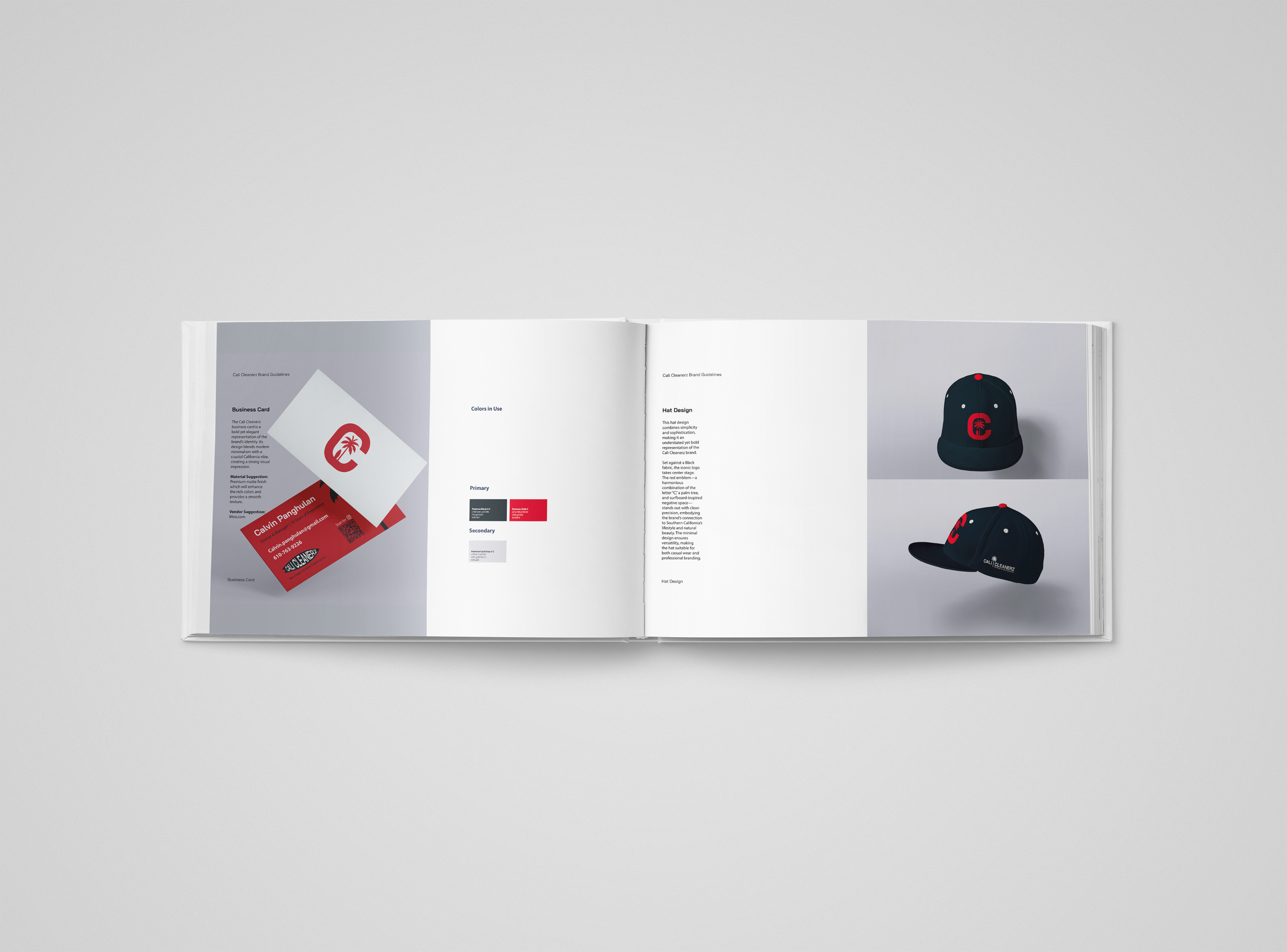
The Cali Cleanerz brand was built to shine — literally and visually. I designed a custom logo that blends urban edge with coastal cool, pairing strong type with sleek, glass-like motifs. The mark reflects the company’s precision, professionalism, and pride in their work — all with a nod to the sunny SoCal vibe they represent.
Supporting collateral includes bold, high-contrast business cards, printed t-shirts, and branded hats — each piece designed for real-world wear and everyday hustle. The apparel features the core logo and alternate lockups, turning every crew member into a walking billboard. The color palette keeps it simple and impactful — bright whites, deep blacks, and crisp accents that feel clean and confident, just like the work they do.
From logo to gear, the Cali Cleanerz identity is all about clarity, consistency, and showing up ready to work.
Tactical support
Logo Design + Business Cards + Apparel Design (T-Shirts & Hats)
Tools of the trade
Illustrator + Photoshop


