Trimax Landscaping llc.
the Mission
Forge a bold, modern identity for one of the Main Line’s top landscaping companies.
Trimax Landscaping needed a brand that would command attention in a saturated market — something clean, trustworthy, and built to last. The company prides itself on perfection, cleanliness, client satisfaction, and crafting tailored landscapes that elevate curb appeal and make homes more beautiful. The goal: create a visual identity that reflects that same standard of care.
the execution
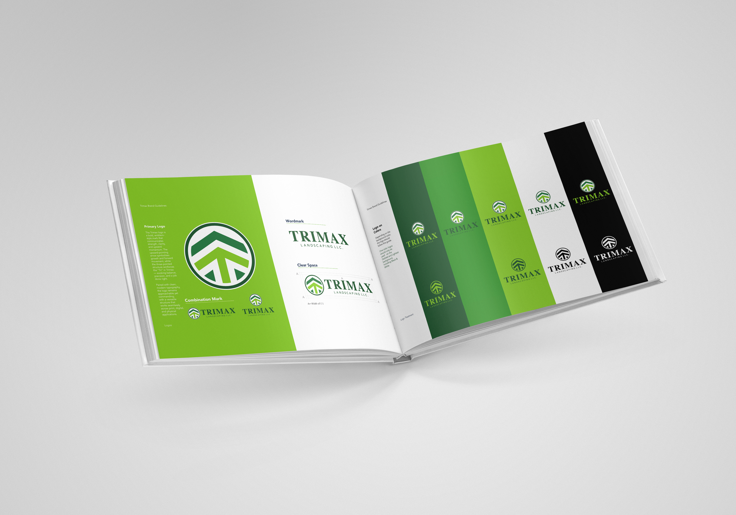
Designed for precision. Built for curb appeal.
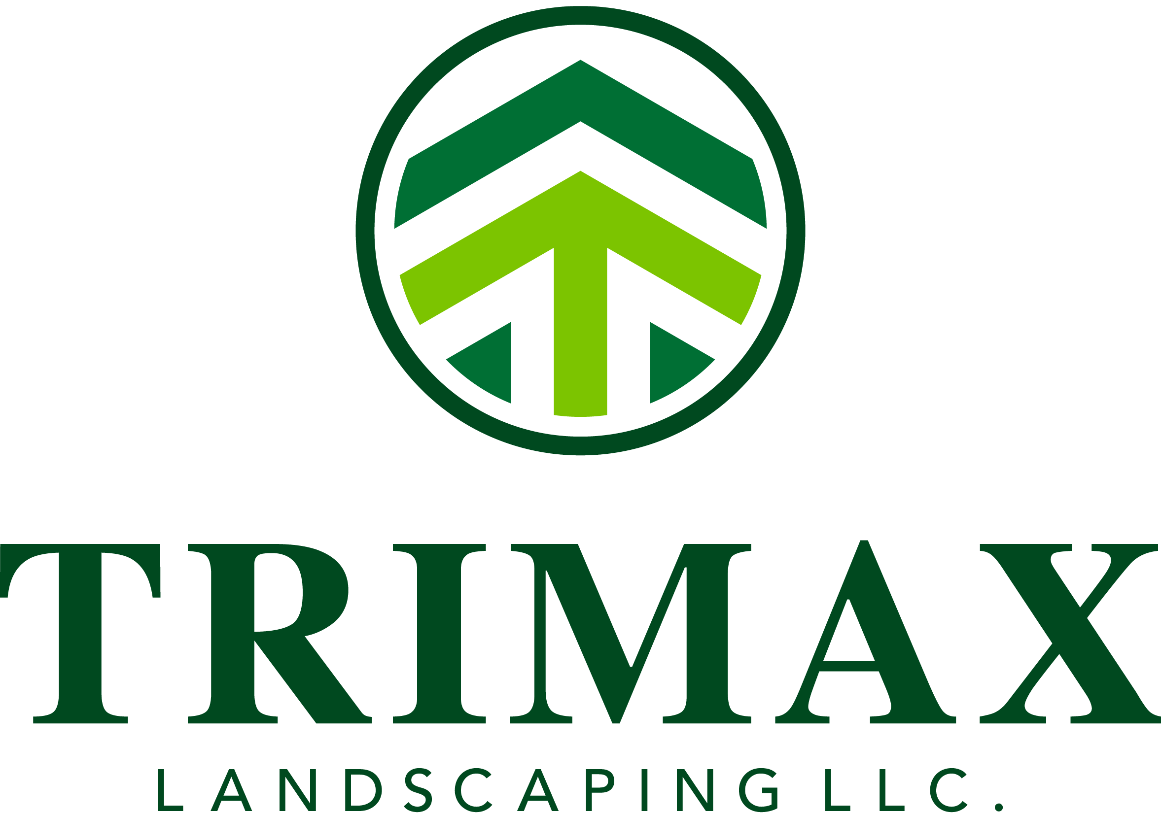
The brand was constructed with the same intentionality Trimax brings to its work. A sharp, emblem-style logo communicates forward momentum and structure, while clean typography and an earthy green-and-brown palette nod to healthy lawns, rich soil, and a job done right. Every element — from the upward-pointing arrow to the controlled color applications — was engineered to echo Trimax’s commitment to neatness, visual harmony, and customer satisfaction.
Tactical Support
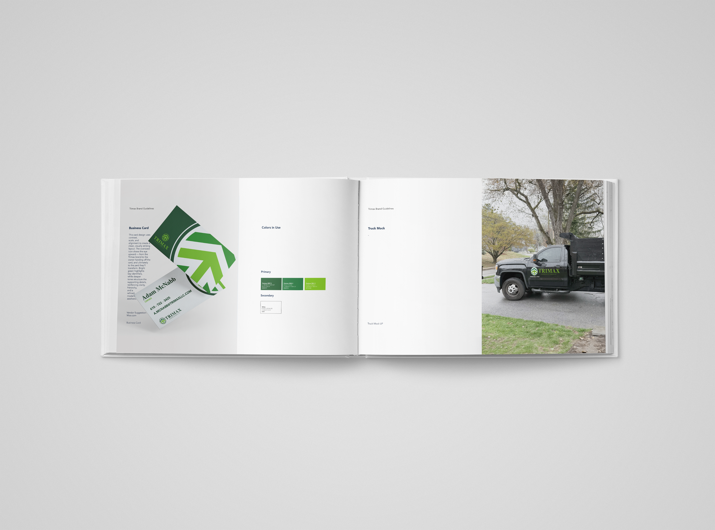
Logo Design + Color System + Typography + Business Cards + Vehicle Wraps
Tools of trade
Illustrator
Photoshop
Indesign